Choosing the Right Font for Your Logo: A Guide for Creators
Choosing the right font for your logo is a critical step in creating a professional and memorable brand image. For creators, your brand is your identity, so it's important to create a logo that best represents who you are to your audience. One element that significantly impacts the look of your logo is typography.
When choosing the right typography for your logo, it is essential to select the best font that correctly communicates your brand identity and values. A well-designed logo font can make your logo look professional, while a poorly designed one can make it appear amateurish and difficult to read. In this article, we'll explore the best logo fonts for creators and how to choose the perfect one for your brand.
Understanding Typography: Fonts vs. Typeface
A typeface serves as a comprehensive collection of glyphs or sorts, encompassing letters, numbers, and punctuation that share common design features. These features include aspects such as the weight and balance of letters, the height disparity between uppercase and lowercase characters, and the presence or absence of serifs. Arial, a widely used typeface, exemplifies this category, embodying a specific design style.
In contrast, the term "font" delves into the specific attributes of a typeface, referring to its distinct weight, size, and width. For instance, Arial functions as a typeface, while Arial Regular 14 point and Arial Black 16 point represent different fonts within the Arial type family. Each variation in size, weight, or style within a typeface constitutes a unique font. Therefore, the key discrepancy lies in the fact that a typeface encompasses the overall design characteristics, while a font denotes a particular size and weight within that design, forming a cohesive type family with shared design elements.
Main Types of Logo Fonts
Typography comes in many different styles, each with its own set of characteristics. The choice of font will depend on your brand, the perception you want to create, and the audience you want to appeal to. Here are the four main types of logo fonts:
- Serif: Serif typefaces are conventional fonts with small lines or flourishes at the ends of the lettering. They are typically associated with a classic and formal style. Serif fonts are perfect for brands that want to convey a sense of tradition and authority, such as universities and high-end brands.
- Sans Serif: Sans-serif fonts have clean lines and don’t have small lines at the end of the lettering. They are more modern and straightforward and are often used for contemporary brands. The simplicity of sans-serif fonts makes them perfect for technology, software, and professional services brands.
- Script: Script fonts mimic handwriting by using cursive lines. They are elegant, sophisticated, and feminine and work well for lifestyle or beauty brands. Script fonts can also convey a sense of warmth and creativity, making them ideal for small businesses and creative firms.
- Display: Display fonts are decorative and bold, used for creating an impact. They are often used for headlines and titles and are perfect for attention-grabbing logos. Display fonts come in various styles and can be used for fashion, music, and entertainment brands seeking bold and memorable logos.
How Many Fonts Should You Use in a Logo?
It is recommended to use a maximum of two or three different fonts in your logo design. Using too many fonts can make your logo appear busy, confusing, and unprofessional. When choosing the typography for your logo, you should pair fonts that complement each other and that align with your branding voice and style.
How to Combine Logo Fonts?
When using multiple fonts in your logo, it's crucial to ensure they work well together. Here are a few font pairing ideas:
- Serif logo text and sans-serif slogan
- Sans-serif logo text, serif supporting text
- Script logo text and serif supporting text
- Sans-serif logo text and sans-serif supporting text
The Best 20 Logo Fonts
With so many options available, choosing the right font for your brand logo can seem like an impossible task. To help you narrow down what you’re looking for, here are 20 examples of the most popular types of fonts, their common features, and helpful examples.
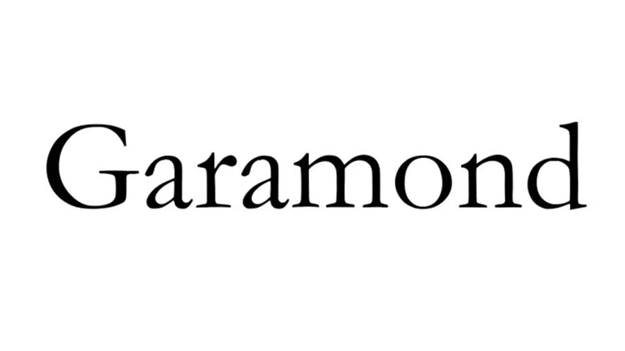
1. Garamond
Known for its bracketed or curved serifs and slight stroke variations, Garamond offers a timeless and refined aesthetic, conveying both playfulness and sophistication.
Notably featured in early Apple branding and the American Eagle logo, Garamond remains a popular choice for designers, especially in the realm of fashion or jewelry, and its OpenType functionality adds versatility, making it one of the most sought-after fonts for creating enduring and stylish visual identities.
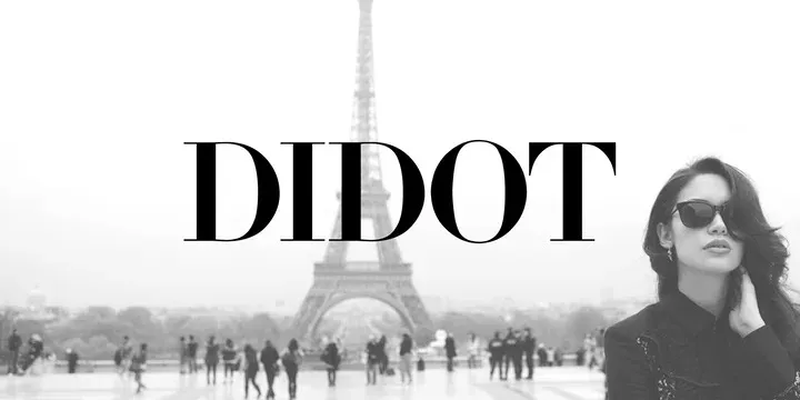
2. Didot
A contemporary serif font with high contrast between thick and thin strokes, Didot finds its niche in the world of fashion and beauty brands, aligning well with high-end clothing labels like Giorgio Armani and lifestyle magazines such as Vogue and Harper’s Bazaar.
Like its counterpart Bodoni, Didot's letterforms feature a pronounced thick-to-thin stroke contrast, contributing to a dimension that is slightly more stretched and curved, giving the font a classic yet modern appearance.
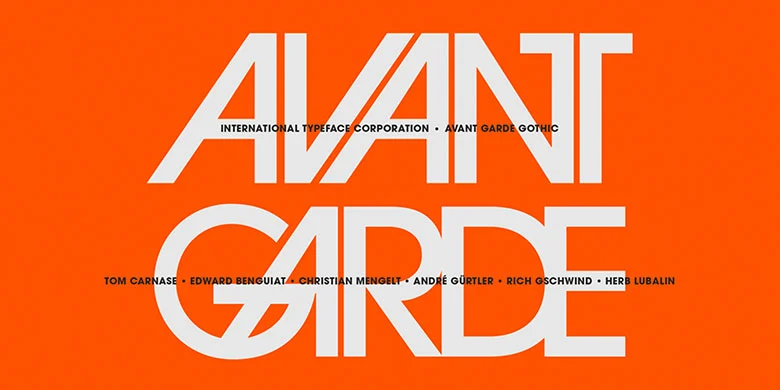
3. Avant-Garde
Originally designed by Herb Lubalin and Tom Carnase in the 1970s, this sans-serif font was revolutionary for its time, embodying the experimental spirit of the era. Avant-Garde's geometric precision and circular strokes create a visual rhythm that sets it apart.
With its bold, uppercase lettering and circular geometric shapes, it has found popularity in modern and artistic design contexts, especially in editorial layouts and brands such as Adidas and Remax. Avant-Garde’s ability to convey a sense of modernity, creativity, and artistic expression makes it a favored choice for those seeking a bold and unconventional typographic identity.
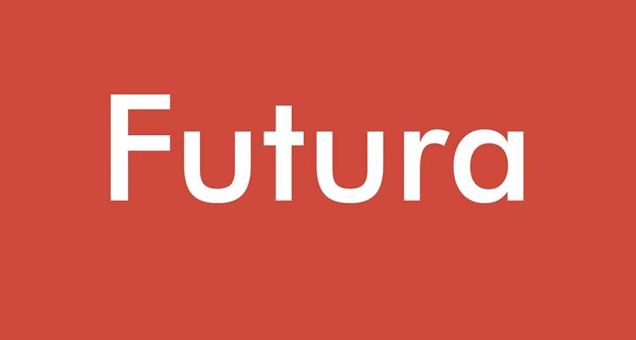
4. Futura
Futura, a timeless sans-serif font meticulously crafted by Paul Renner in 1927, stands as one of the most successful and widely used typefaces of the 20th century. Renowned for its versatility and unique geometric structure, Futura has become a staple for modern and minimalist brands seeking an optimistic touch of modernism.
The font's distinctive design, featuring uniform thickness in each letter, facilitates easy reading on various screens. It’s most commonly seen gracing logos of iconic brands like FedEx, Volkswagen, Swissair, Dolce & Gabbana, Best Buy, and Supreme.
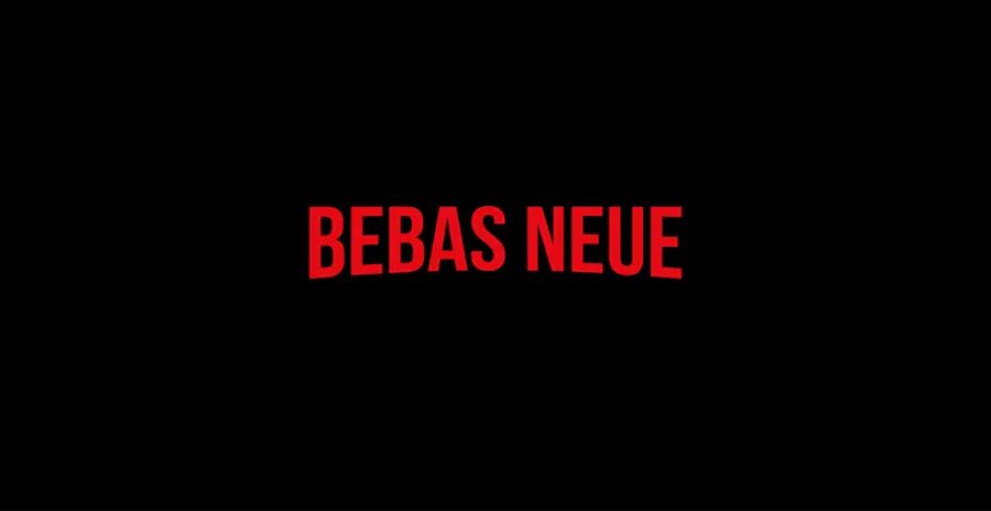
5. Bebas Neue
A sans-serif typeface, Bebas Neue flaunts clean and bold lines that render it exceptionally fitting for corporate and athletic brands.
Most commonly seen as the font used for the Netflix logo, this font exhibits a minimalistic aesthetic with a robust and impactful presence. Its wide and open letterforms, coupled with a large x-height and subtly rounded corners, contribute to a modern, geometric feel inspired by the DIN typeface family.
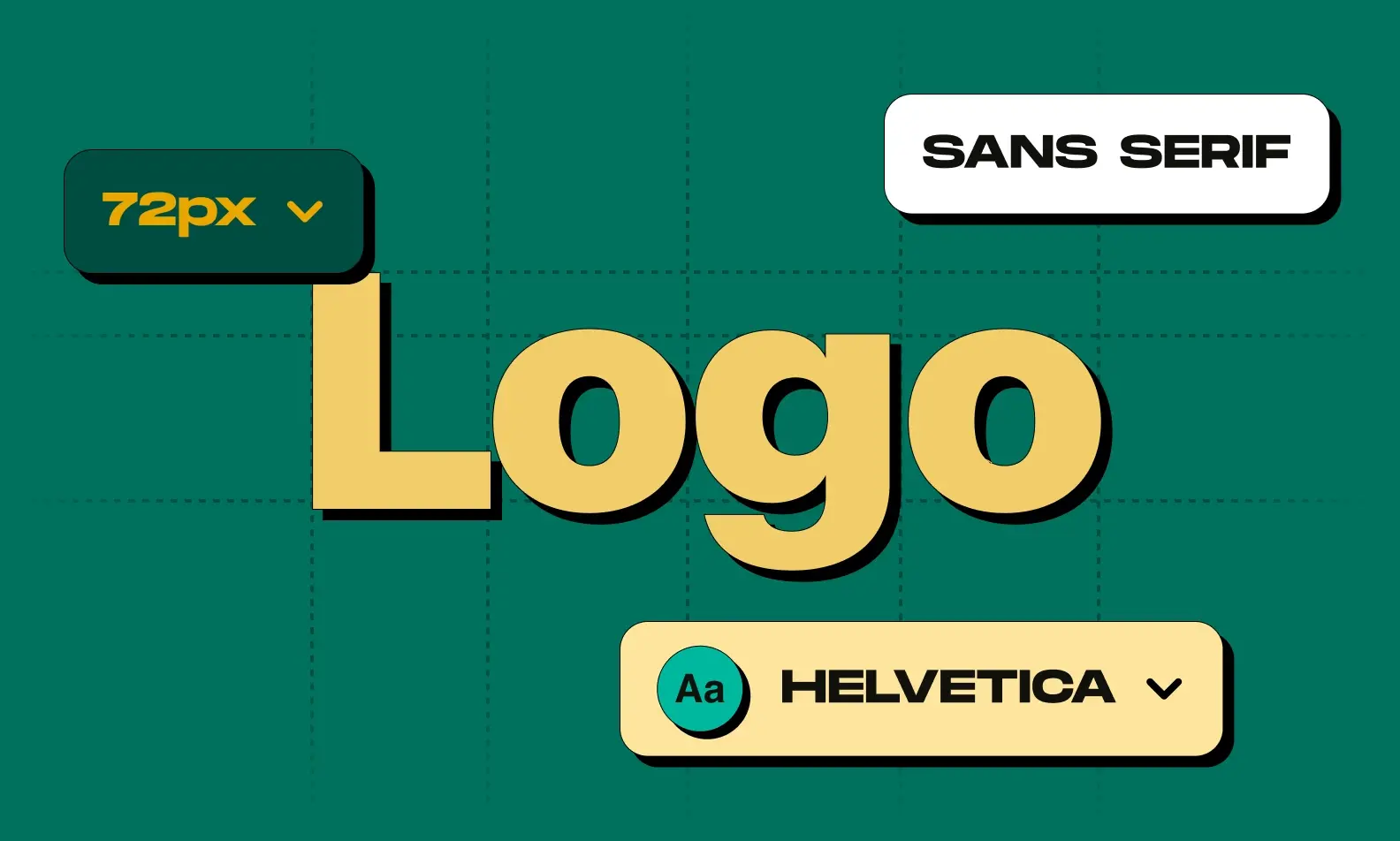
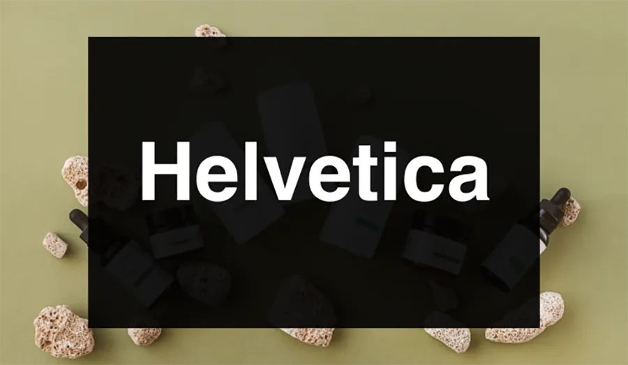
6. Helvetica
A quintessential sans-serif font, Helvetica is renowned for its high legibility and adaptability that suits both tech and fashion brands seamlessly. Praised consistently in lists of top fonts and designs, the font’s plain letterforms and consistently thick strokes contribute to its readability, akin to open sans.
Recognizable as one of the most iconic sans-serif fonts globally, Helvetica has left an indelible mark in commercial typefaces, with its ubiquitous presence in logos for companies like Panasonic, Target, and Skype, as well as its ubiquity in web design.
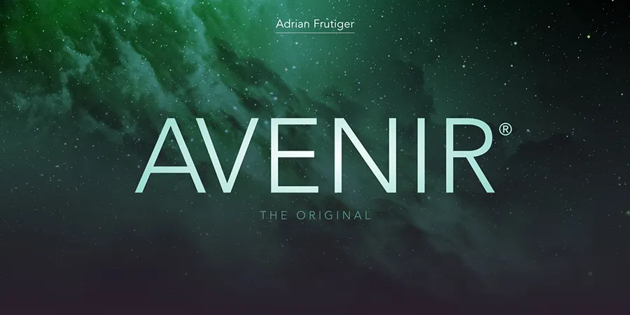
7. Avenir
A contemporary typeface designed by Adrian Frutiger, Avenir exudes a modern and minimal aesthetic, making it an ideal choice for professional brands seeking a clean and sophisticated look.
While its geometric roots echo the stylistic qualities of Futura, Frutiger introduced a nuanced approach, bestowing Avenir with a more organic feel to humanize it. The varied stroke weights, in contrast to Futura's bold letter forms, strike a balance that renders Avenir suitable for a range of applications, including smaller sizes like logos, business cards, and letterheads.
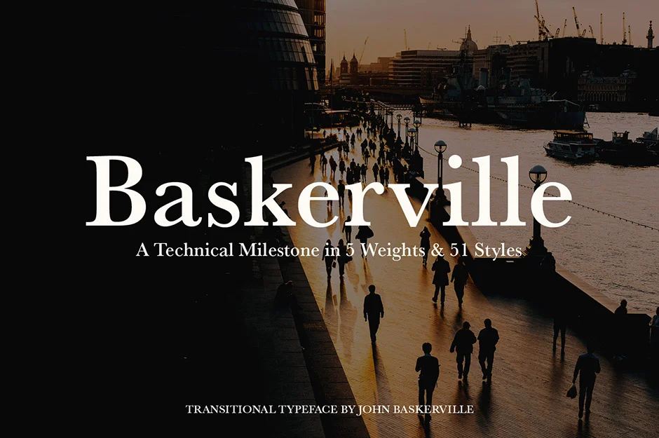
8. Baskerville
An elegant serif font with a modern twist, Baskerville emerges as an ideal choice for luxury brands seeking sophistication in their logo design. Similar to Garamond, Baskerville exhibits slightly sharper edges and transitional serifs, creating a refined and classy appearance.
Classified as a transitional typeface, its higher contrast between thick and thin strokes, accompanied by sharpened serifs and a vertical axis, strikes a harmonious balance between old-style and modern typefaces. Its versatility in small sizes and readability make it an excellent choice for logo design, exuding professionalism and timeless charm.
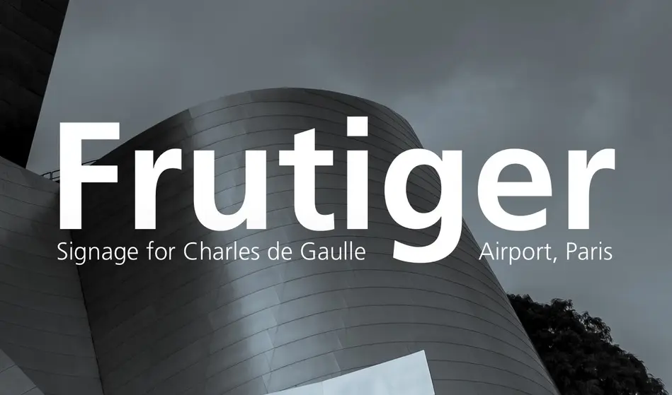
19. Frutiger
Designed for clarity, Frutiger's clean and straightforward shape enhances its adaptability to both large and small screens, akin to Futura. The font family's versatility is further exemplified through its range of styles, spanning from the lightest to the boldest weights.
Originally crafted by Adrian Frutiger, the font underwent a contemporary update by Japanese designer Akira Kobayashi, the mind behind Monotype, giving it a modern touch. Widely embraced by renowned brands such as Ericsson and RadioShack, Frutiger's timeless design and readability make it a top-tier selection for businesses seeking a flexible and professional appearance in their logos.
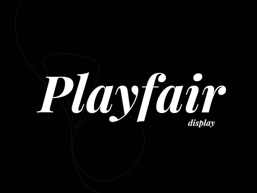
10. Playfair Display
Ideally suited for classic and elegant brands, Playfair Display particularly excels in the use of headlines and titles. Inspired by the 18th-century European enlightenment and the transition from broad nib quills to pointed steel pens, this serif typeface exults clarity and a remarkable crispness.
Playfair Display features a substantial x-height, short descenders, and extra short capitals. Despite its historical inspiration, the font displays a hint of modernity, making it a versatile choice for a variety of design contexts. Playfair Display is not only highly legible but also adaptable to smaller sizes, providing a perfect blend of classic sophistication and contemporary flair for brands seeking an elegant typographic identity.
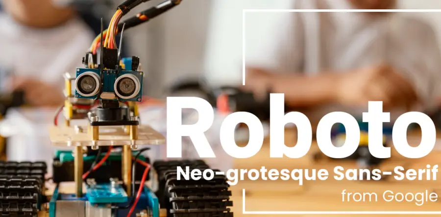
11. Roboto
A contemporary and sophisticated sans-serif font, Roboto stands out as an excellent option for tech and business brands. Its modern aesthetic and high legibility make it versatile, particularly well-suited for applications where space is limited.
Next to Impact, Roboto has been known to be one of the most commonly used fonts for creators on YouTube. Its clean lines and modern appeal allow it to be legible with most screen sizes, aligning seamlessly with YouTube’s visual requirements for thumbnails, where clarity and visual appeal are crucial in grabbing viewers' attention.
12. Impact
This robust sans-serif font has gained widespread popularity, especially among famous YouTube creators like PewDiePie, for its bold and attention-grabbing characteristics. The font's thick strokes and compact design allow it to be highly visible even in smaller sizes, making it a perfect choice for creating impactful thumbnails for your YouTube videos.

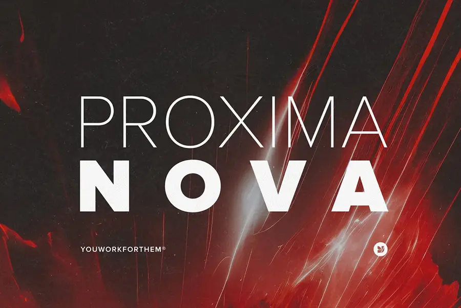
13. Proxima Nova
Proxima Nova, a contemporary and geometric sans-serif font, emerges as an excellent choice for innovative brands seeking a modern typographic identity. Recognized for its sleek design, this font is highly legible and exhibits remarkable versatility, making it an ideal option even in smaller sizes.
With its clean lines and geometric precision, Proxima Nova captures a sense of modernity and innovation, aligning seamlessly with the aesthetics of forward-thinking brands in the tech and creative industries.
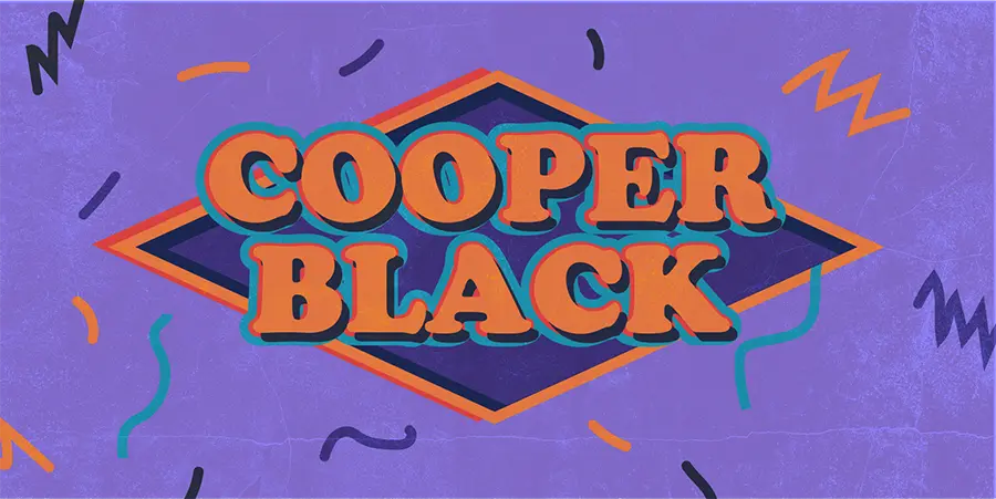
14. Cooper Black
Considered a ubiquitous and distinctive font, Cooper Black finds its presence across a multitude of domains, becoming a go-to choice for movie and album titles, jewelry, airlines, and a diverse array of retail establishments. Its widespread adoption speaks to the font's versatility and recognizability, making it a favored typeface for conveying bold and impactful messages.
Cooper Black's bold and rounded letterforms contribute to its enduring popularity, ensuring its prevalence in various visual contexts, from entertainment and music to retail and service industries, showcasing its adaptability and timeless appeal.
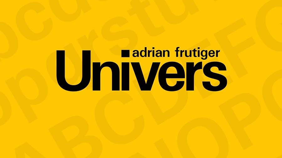
15. Univers
Another font crafted by designer Adrian Frutiger, Univers strikes a delicate balance between thick and thin strokes, departing from perfect geometric precision in favor of nuanced design.
This sans serif font’s attention to detail becomes apparent in its deep subtleties, as seen in the eBay logo, where each character displays unexpected features and stroke variations, adding personality to the design. Univers is also available in different weights and styles, so it’s suitable for all different types of logos.
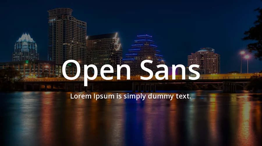
16. Open Sans
Released in 2010 as part of Google’s esteemed Google Fonts library, Open Sans was initially crafted for optimal legibility on computer screens, positioning it as an ideal choice for web design.
Characterized by elegance in simplicity, this sans-serif font maintains well-balanced letterforms across different weights and styles, delivering a pleasant and modern appearance. Its open, rounded letterforms ensure outstanding legibility, even at smaller sizes, which is crucial for online content and mobile devices.
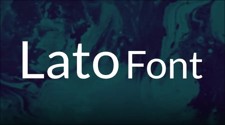
17. Lato
A modern, contemporary sans-serif font, Lato offers a compelling choice for crafting your own brand logo. Its versatile design makes it well-suited for creative headlines, logos, and editorial typography, imparting a sleek and contemporary aesthetic to your visual identity.
The font’s attention to detail is apparent through its subtle treatment of individual glyph fluctuations, achieving a harmonious balance between straight lines and curves. This approach enhances the autonomy of each character and alleviates tension within the overall design, making it more memorable and visually impactful across various applications.
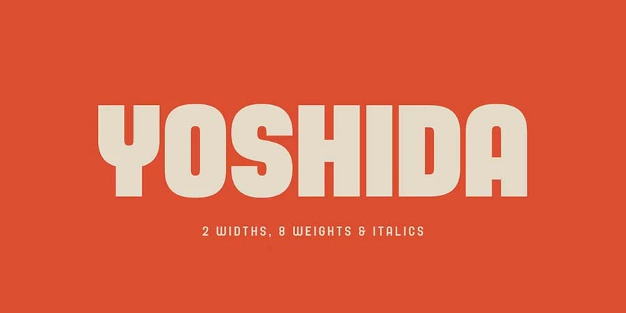
18. Yoshida
Ideal for brands seeking a strong visual presence, this font stands out with elongated bold letters and rounded lettering, creating a distinctive impact that is unparalleled.
Particularly effective as a stand-alone element in logo designs, Yoshida showcases its uniqueness through its striking aesthetics. Beyond its standalone prowess, this font also harmonizes seamlessly with various other fonts, offering versatility and adaptability in crafting impactful and cohesive logo designs.
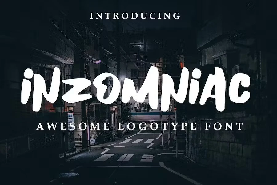
19. Inzomniac
Inzomniac font is a modern and captivating typeface that can elevate your logo design, particularly if your brand draws inspiration from urban and city aesthetics. Its contemporary style and unique script can bring a fresh, dynamic energy to your visual identity.
With its all-capital format, Inzomniac is specifically tailored for logo use, ensuring that your brand stands out with a bold and memorable presence. It is probably the best logo design for commercial artists looking to attract viewers to their brand at first glance.
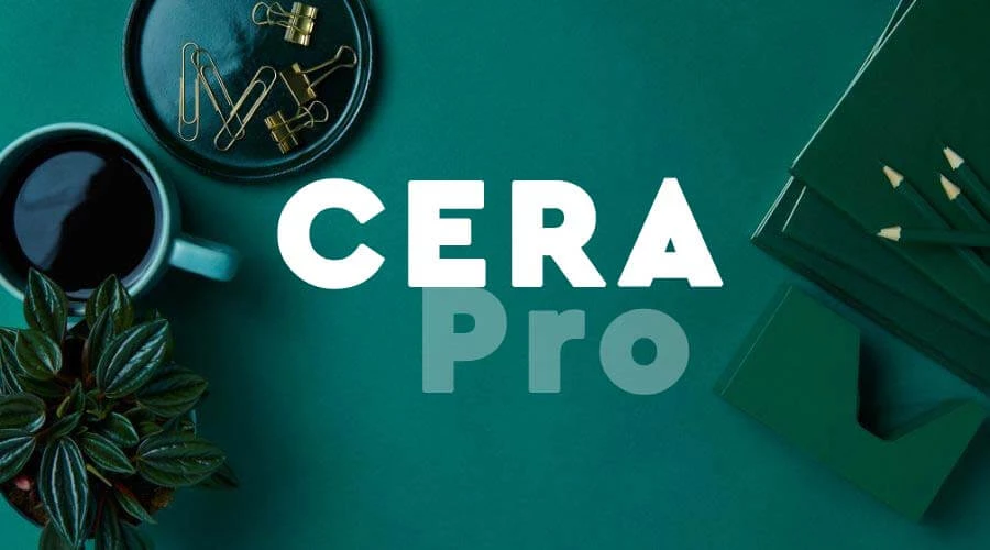
20. Cera Pro
With its bold and rounded design, Cera Pro stands out as a prominent member of the renowned Cera font family. With six weights, a 10-degree slanted clean italic, dingbats, and arrows, Cera Font caters to designers seeking clean headlines for print and on-screen across multiple languages.
The font's memorable thick-set and uniquely crafted lettering imparts a soft feel, making it a favored choice for many brands looking to create distinctive logos. Commonly spotted in magazine logos and website template headlines, Cera's inimitable design draws attention and leaves a lasting impact.
How to Choose the Best Logo Font For Your Personal Brand? 6 Tips
Here are some tips for choosing the best logo font for your personal brand:
- Consider Scalability: your logo will appear in various sizes and formats, so it’s vital to select a font that’s legible and recognizable even when scaled down.
- Focus on Legibility: Legibility is crucial when choosing a font for your logo. Ensure that the font is comfortable to read and clear at different sizes and resolutions.
- Reflect Your Brand Personality: Choose a font that is in line with your brand's voice, personality, and style. Your logo should reflect your brand's values and message.
- Keep it Simple: Simplicity is key when it comes to logo design. Choose a font that is easy to read, recognizable, and that won’t look dated or out of style in a few years.
- Avoid Trends: While trendy fonts may be popular at the moment, they are likely to be less effective in the long run. Choose a classic font that will be relevant to your brand for years to come.
- Pair it Well: If you choose to use more than one font in your logo, ensure that they pair well and complement each other.
Wrapping Up!
Choosing the right font for your logo is a critical step in creating a professional and memorable brand image. With so many fonts available today, it can be challenging to know where to start. Be sure to select a font that matches your brand's personality, values, and voice, and remember to keep it simple!
Build Your Brand With Fourthwall
Fourthwall is your go-to platform for building a personal brand for creators. Fourthwall's platform allows for full customization of your shop, homepage, and membership site and can showcase all your digital content, making it easy for your audience to connect with your brand. Fourthwall assists you in taking your creator website to the next level and, in the process, growing your digital media presence. Get started today.
FAQ: Choosing the Right Font for Your Logo
What is the best font for a logo?
The best logo font depends on your brand identity, audience, and tone.
Popular options include modern fonts like Proxima Nova, Helvetica, and Futura for clean brands, while serif fonts like Garamond and Didot work well for elegant or classic logos.
What’s the difference between a font and a typeface?
A typeface refers to the overall design of lettering, such as Helvetica or Garamond, while a font is a specific style within that typeface, like weight or size.
Understanding this difference helps creators choose the right font family for consistent logo design.
Are sans-serif fonts better for modern logos?
Yes, sans serif fonts are widely used in modern logo design because they feel clean, minimal, and highly legible across screens.
Fonts like Proxima Nova, Avenir, Open Sans, and Helvetica are especially popular for creators building digital-first brands.
When should you use a serif font in a logo?
A serif font is ideal if your brand wants to communicate tradition, authority, or sophistication.
Serif typefaces like Garamond, Baskerville, Didot, and Bodoni are often used for luxury brands, publishing, and elegant business logos.

Matt Keyser is a writer at Fourthwall who lives at the intersection of social media and Creator culture. With 4+ years of experience covering industry trends, his work focuses on helping Creators and brands understand how to turn their passion into a thriving business while maintaining a constant pulse on the latest eCommerce and social media trends.