5 Web Designing Tips to Boost Your Site's Appeal
In today's creator environment, where everyone wants to stand out, having an engaging and well-designed website is crucial.
While the idea of designing a website might feel overwhelming, there are numerous tools available that cater to beginners with no coding or design experience, making the process easier than ever before.
To assist you in quickly launching your new site, we've put together a comprehensive guide on the best practices for designing it. From defining your brand elements to optimizing for mobile responsiveness, this guide will equip you with the knowledge and resources needed to create a standout website that effectively captures your audience's attention and achieves your goals.
Why is the Design of Your Website Important?
For creators embarking on e-commerce, your website’s design is crucial as it serves as visitors' first impression of your brand. Just like a physical storefront, your website's design sets the tone for how users perceive your business. A well-designed website not only captures attention but also engages users, encouraging them to explore further and potentially convert into customers or clients.
Elements such as layout, color scheme, typography, and navigation all contribute to the overall user experience, shaping perceptions of your brand's professionalism, trustworthiness, and credibility. A poorly designed website, on the other hand, can drive users away, leading to missed opportunities for engagement and sales.
Moreover, having an effective website design goes beyond mere aesthetics; it directly impacts usability and functionality. A user-friendly interface can enhance the overall experience for visitors, making it easy for them to find the information they need and complete desired actions, whether it's downloading content, making a purchase, or signing up for a newsletter.
Intuitive navigation, clear calls-to-action, and responsive design that adapts to different devices are all essential components of a well-designed website that maximizes user engagement and conversion rates. In today's digital age, where online presence is often the primary touchpoint for businesses, investing in a high-quality website design is essential for any creator’s success.
5 Tips For Designing An Outstanding Website
1. Determine Your Website’s Purpose
Before jumping in, take some time to consider your overall goal for your website. Without a clear purpose, your website risks becoming a disjointed collection of elements lacking direction or effectiveness.
Understanding the intended goals, target audience, and desired outcomes enables creators to make informed decisions about content, design, and functionality. It ensures that every aspect of the website is aligned with its overarching objectives, whether it’s driving sales, increasing brand awareness, or generating community engagement.
By defining the purpose upfront, creators can lay the foundation for a website that not only looks appealing but also effectively serves its intended audience. This will ultimately lead to greater success and satisfaction for both the creator and the website's users.
2. Choose a Hosting Platform
After you’ve decided which direction you want to take your website in, consider choosing a hosting platform that will best utilize your site. Your choice of platform determines not only the ease of design but also the extent to which you can customize your site to match your unique specifications.
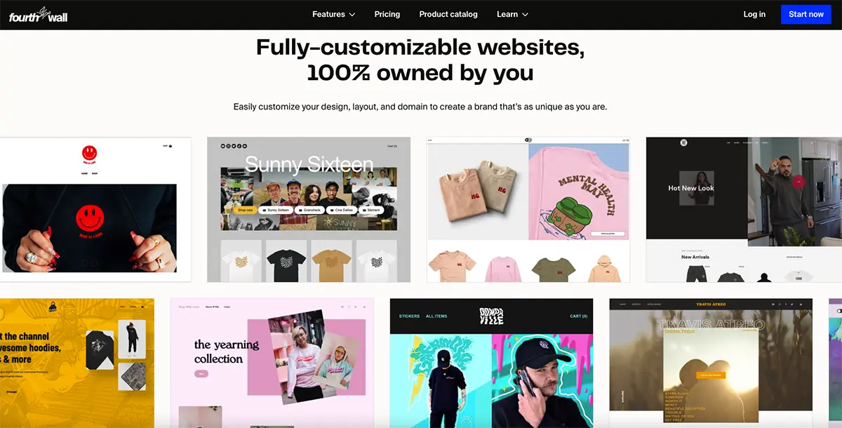
Opting for a platform that offers intuitive design tools and flexible customization options empowers creators to bring their vision to life without technical barriers. While popular website builders like Wix, Squarespace, and GoDaddy provide creators with the necessary tools to build their websites with ease, platforms like Fourthwall excel in this regard, particularly for creators seeking to establish their e-commerce presence without the hassle of having to understand basic coding or design.
With features tailored to the needs of online sellers, such as seamless product listings, print-on-demand, secure payment gateways, and customizable storefronts, Fourthwall enables creators to not only showcase their products but also manage sales and customer interactions seamlessly.
3. Define Your Brand Elements
Defining your brand elements in your website's design is pivotal for crafting a cohesive and memorable online presence. Elements such as color, typography, imagery, logos, and tone collectively shape your website's visual identity, effectively communicating your brand's personality and values to visitors. Here’s a detailed breakdown of how each element can help define your site’s overall design:
Color
Start by carefully selecting a color scheme that establishes the mood aligned with your brand’s identity. Remember, colors can evoke a wide range of emotions and associations, which makes them powerful tools for shaping your brand's overall aesthetic and perception. Here are some common emotions and associations associated with various colors:
- Red: Often associated with energy, passion, excitement, and urgency. It can also convey warmth, love, and boldness. Red can be attention-grabbing and is commonly used to evoke a sense of action or urgency.
- Blue: Conveys calmness, trustworthiness, professionalism, and reliability. It's often used by brands to establish a sense of security, stability, and authority. Lighter shades of blue can evoke tranquility, while darker shades may convey strength and seriousness.
- Yellow: Represents optimism, happiness, warmth, and positivity. It can also be associated with creativity and innovation. Yellow is often used to grab attention and evoke feelings of joy and cheerfulness.
- Green: Symbolizes growth, harmony, nature, and freshness. It's commonly associated with health, sustainability, and wealth. Green can evoke feelings of balance, renewal, and tranquility, making it popular for brands focused on eco-friendliness or wellness.
- Orange: Combines the energy of red with the optimism of yellow. It's often associated with enthusiasm, creativity, and friendliness. Orange can evoke feelings of warmth, excitement, and vibrancy, making it ideal for brands seeking to stand out and exude approachability.
- Purple: Represents luxury, royalty, spirituality, and creativity. It's often used to convey sophistication, elegance, and mystique. Purple can evoke a sense of opulence, making it popular for luxury brands or those targeting a more artistic and imaginative audience.
- Black: Symbolizes power, sophistication, elegance, and authority. It's often used to convey a sense of luxury, prestige, and exclusivity. Black can evoke feelings of strength, mystery, and formality, making it a versatile choice for brands aiming for a sleek and timeless aesthetic.
Font
Typography further reinforces your brand’s identity, with font choices conveying nuances of formality, modernism, or creativity. High-quality, relevant imagery not only captures attention but also reinforces your brand's narrative and message. Different typefaces evoke distinct emotions and associations, with serif fonts conveying tradition and authority, sans-serif fonts exuding modernity and simplicity, and script fonts adding a touch of elegance or creativity.
Additionally, selecting appropriate font sizes, weights, and spacing ensures optimal readability across various devices and screen sizes, enhancing the overall user experience. By carefully choosing typography that aligns with your brand's identity and enhances readability, you can create a cohesive and visually appealing website that effectively communicates your message to your audience.
Imagery
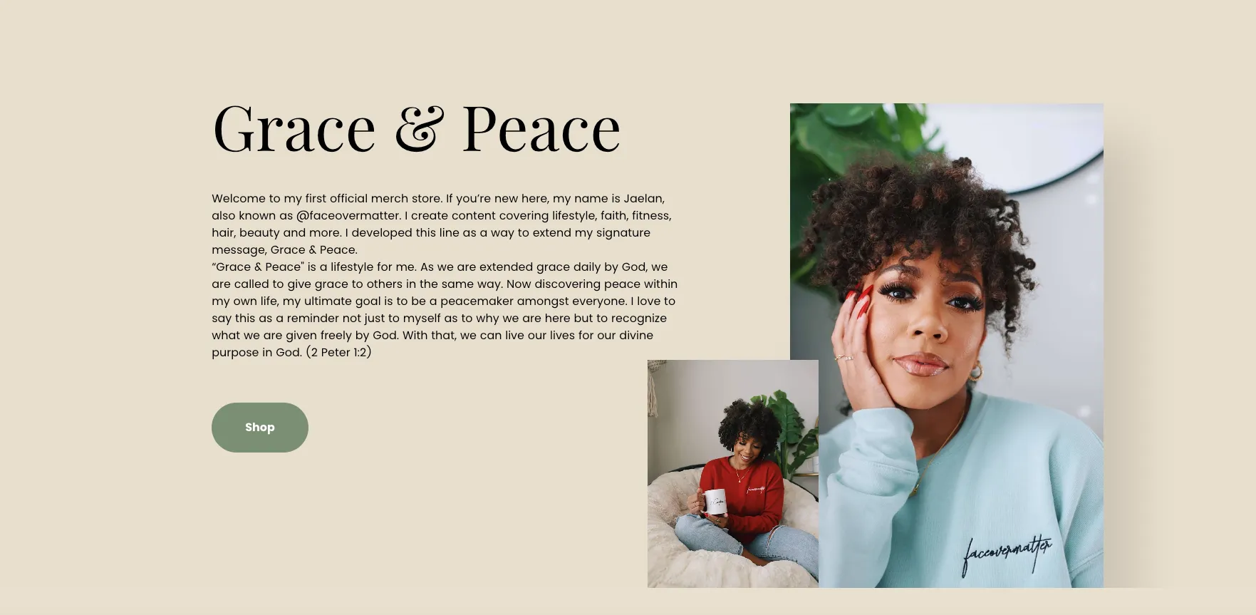
Incorporating the right imagery in your website's design is crucial for creating a visually appealing user experience. Photography, illustrations, and animations are all powerful visual elements that can enhance the aesthetic appeal and usability of your website.
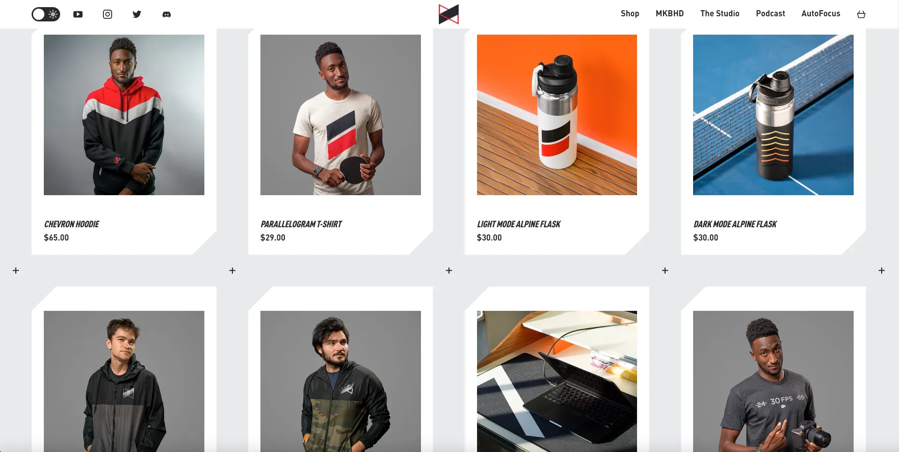
Displaying high-quality photos on your site can help showcase products, services, or brand values, evoking emotions and creating a connection with your audience. For example, if your site is a storefront for selling products, then consider using images that best represent your items, making them stand out to potential customers. A professional-looking product image can help differentiate you from other online shops whose products may not look that appealing to consumers.
Furthermore, Incorporating illustrated or animated icons in your website design can significantly enhance its effectiveness by improving visual appeal, aiding navigation, and increasing user engagement. Illustrated icons add personality and charm to your website, making it more visually appealing and memorable for visitors. Additionally, animated icons can draw attention to important elements or calls-to-action, guiding users' focus and improving usability.
Logos
Finally, creating an effective brand logo can significantly elevate your website design by serving as a distinctive visual symbol that embodies your brand's identity and values. A well-designed logo instantly communicates professionalism, credibility, and uniqueness, helping you establish a strong first impression to visitors and differentiate your site from competitors. Remember, your logo helps define your brand in a sea of creators who are also running their own site, so make sure it's unique and stands out.
4. Interface and CTAs
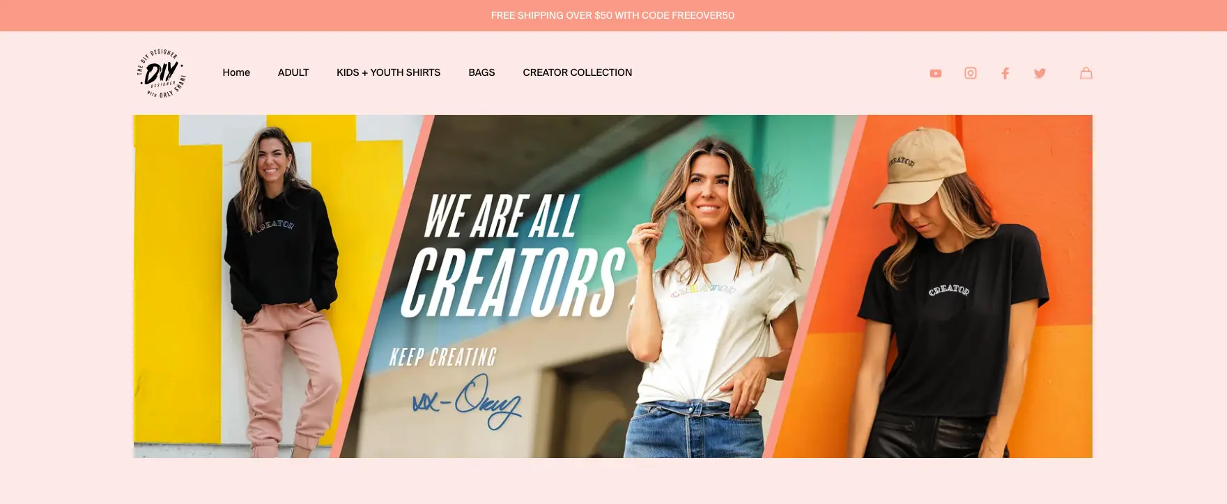
Now that you have defined the overall aesthetic of your website’s design, it’s time to employ a strategic layout. A clutter-free layout with intuitive navigation menus and a clear organization of information can help users quickly find what they're looking for without feeling overwhelmed or confused.
By presenting content in a straightforward manner, you enhance usability and accessibility, making it easy for users of all backgrounds and abilities to engage with your website effectively. Moreover, a straightforward interface fosters trust and credibility, as it demonstrates professionalism and attention to user needs, ultimately encouraging visitors to spend more time on your site and explore further.
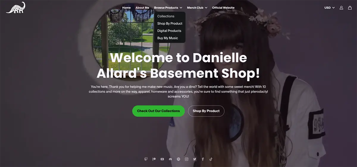
Next, strategically incorporate call-to-action (CTA) buttons throughout your website to enhance its effectiveness. These buttons will prompt users to take specific actions that align with your site’s goals, encouraging engagement and driving conversions. By using persuasive language, contrasting colors, and compelling design, CTAs can stand out and capture attention, guiding users toward desired actions such as making a purchase, signing up for a newsletter, or contacting your business.
By combining a straightforward interface with strategically placed CTAs, you create a user-centric website experience that maximizes engagement, encourages interaction, and ultimately leads to greater business success.
5. Be mobile-friendly
Having a mobile-friendly website ensures that users have a consistent and enjoyable experience regardless of the device they're using. By providing a smooth user experience on mobile devices, you not only cater to the preferences of a growing mobile audience but also enhance your website's visibility and ranking on search engine results pages, as search engines prioritize mobile-friendly websites in their rankings.
Though most hosting platforms these days provide some type of mobile optimization for custom websites, the end result doesn't always turn out great on your phone. Fortunately, platforms like Fourthwall provide the necessary tools to tailor your site’s design and layout to mobile devices by utilizing responsive themes and customizable templates through Mobile Apps. By utilizing your Fourthwall site’s colors, fonts, and other settings, Mobile Apps creates a personalized experience for all your members, giving them instant access to your shop and members’ area straight from their phone.
Common Website Design Mistakes To Avoid
Forgetting about UX
Neglecting user experience (UX) considerations can result in a confusing or frustrating browsing experience, leading to higher bounce rates and decreased user engagement. When users encounter difficulties navigating your website, whether it’s finding information or completing tasks, they are more likely to abandon the site in favor of a competitor's offering. Moreover, a site with poor user experience can tarnish your brand's reputation and credibility, as users may see a lack of professionalism or care in the design and functionality of your website.
Too Much Content
Overloading your website with excessive content can overwhelm visitors and distract them from the primary focus, leading to a loss of interest. When users are bombarded with too much information, they may struggle to find what they're looking for, resulting in frustration and impatience.
Additionally, dense or cluttered content can hinder readability and comprehension, making it difficult for users to digest the information effectively. To alleviate this issue, prioritize relevant, concise, and easy-to-consume content. By focusing on quality over quantity and employing clear and concise messaging, you can create a more engaging and user-friendly experience that keeps visitors focused and encourages them to explore further.
Inconsistent Design
Inconsistency in design elements, such as colors, fonts, or layouts, can disrupt the website's visual appeal and brand identity, creating a disjointed user experience. When users encounter inconsistent design throughout a website, they may feel disoriented and struggle to navigate effectively. Moreover, inconsistency can undermine your brand’s credibility, as it shows a lack of attention to detail.
Establish clear design guidelines and standards that govern the use of colors, fonts, and layouts across the website to maintain a cohesive and visually pleasing design. Following these guidelines ensures your website maintains a cohesive and polished appearance, strengthening your brand identity and improving user experience.
Overlooking Accessibility
Neglecting to make the website accessible to all users, including those with disabilities, can alienate a portion of the audience and lead to inclusivity issues. This not only violates principles of inclusivity and equality but also limits the reach and impact of your website.
To address this, it's crucial to implement accessibility features such as alternative text for images, keyboard navigation options, and clear headings for screen readers. By prioritizing accessibility, you ensure that all users, regardless of ability, can engage with your website fully, creating a more inclusive and welcoming online environment.
Craft Your Dream Website: Explore Fourthwall
A well-designed website is your canvas to showcase your work, connect with your audience, and establish your brand. Focus on your art, not the tech, and let Fourthwall handle the rest–from top-notch product quality to dedicated customer support. Join Fourthwall today and build the right site that will help you connect with your fans like never before.

