How to Make a YouTube Thumbnail: 7 Steps for More Clicks
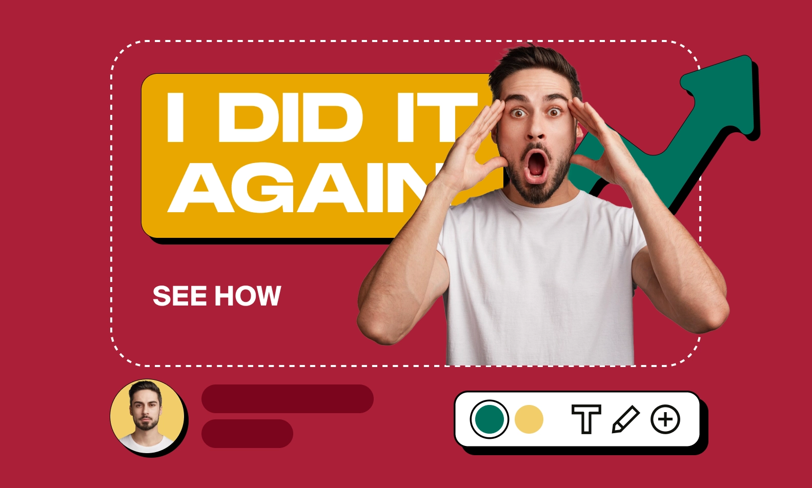
If you're an active creator on YouTube, you already understand how incredibly important it is to make your content stand out — this is where a good thumbnail comes into play.
A thumbnail is a small image that represents a video on YouTube. It is the first thing viewers see before they click on your video, and it serves as a visual representation of your video’s content.
Having a well-crafted thumbnail is crucial in attracting viewers to your videos. It helps bring a level of sophistication to your content, sparking viewer curiosity and potentially driving traffic to your channel. An effective thumbnail will entice viewers into watching your video, while a poorly made thumbnail can make your content go unnoticed.
In this article, we'll present a seven-step guide to creating a YouTube thumbnail that will help your video stand out and attract more views.

Benefits of Creating a YouTube Thumbnail
As a new creator on YouTube, you may be wondering if thumbnails really matter that much. Well, the answer is yes! However, before we explore our list of how to make a great YouTube thumbnail, let’s talk about why they’re so important and the benefits they bring to creators.

Increased Click-Through Rate (CTR)
The click-through rate (CTR) is the percentage of viewers who click on a video after seeing its thumbnail. A well-designed thumbnail can improve the CTR of a video, which is crucial for the success of a channel. A high CTR means more views, engagement, and, ultimately, growth. YouTube recognizes the importance of CTR and uses it as a metric to rank videos in the search results and recommend them to viewers.
Improved Video Discoverability
Custom thumbnails can help increase the discoverability of your videos on the YouTube platform. According to YouTube, an impressive 90% of the top-performing videos feature custom thumbnails, distinct from the auto-generated ones by YouTube's creator studio. They make your video stand out from other videos with generic and unattractive thumbnails, helping you attract viewers who are scrolling through the recommended videos. The more viewers click on your thumbnail, the better your video ranking will be, leading to increased exposure and growth for your channel.
Enhanced Branding
Custom thumbnails can help establish a unique and consistent brand image for your channel. Customized thumbnails give your viewers a sneak peek of your video's content while also associating your brand with a specific style. Once viewers get used to your video thumbnails, they'll be able to recognize your content easily and will be more likely to click on new videos that show up in their feeds.
Better Viewer Expectations
A high-quality thumbnail should depict and convey an accurate idea of what the viewers can expect from the video. An accurate thumbnail creates a perception of what the content of your video is, which can help manage viewer expectations. It ensures that your viewers know what they are signing up for before they even click on your video. If the video fails to meet the expectations conveyed by the thumbnail, then viewers might not return to watch more of your content.
Getting More Subscribers
One of the most exciting benefits of creating high-quality thumbnails is their potential to help you grow your subscriber base. When viewers repeatedly click on your engaging thumbnails and enjoy the content they watch, they’re more likely to hit that subscribe button. Eye-catching thumbnails signal professionalism and consistency, encouraging casual viewers to become loyal fans. If you're looking for more tips on growing your subscriber count, check out this guide: How to Get More Subscribers on YouTube.
7 Steps To Make A Great YouTube Thumbnail
As a content creator, your goal is to provide valuable and entertaining content for your viewers and to achieve this; you need a thumbnail that captures their attention.
Below is our seven-step guide to creating a thumbnail that will help make your YouTube video stand out!
1. Build a Recognizable Personal Brand
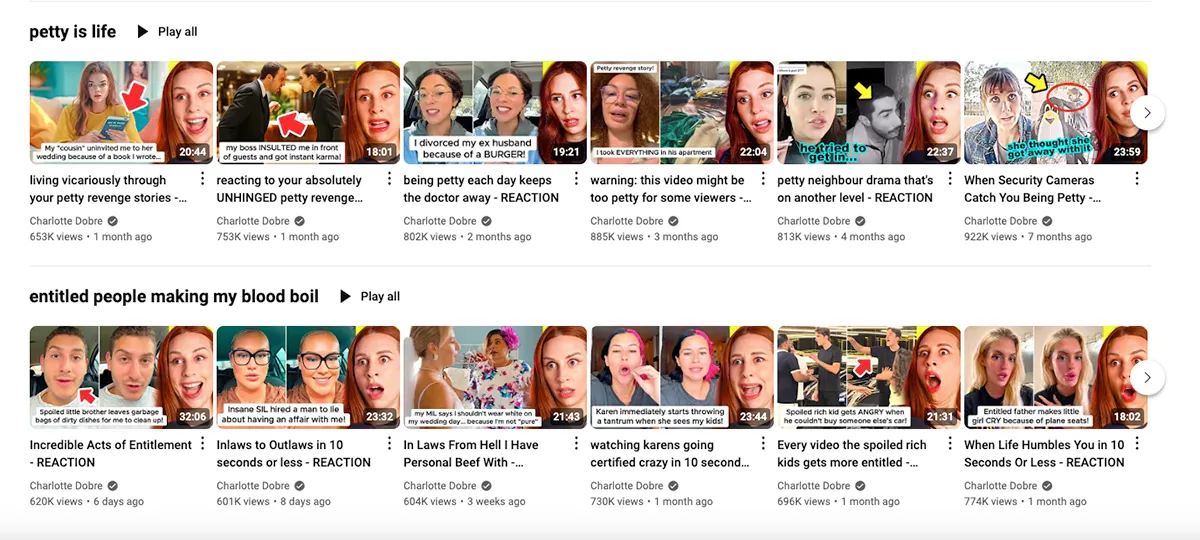
The first step to creating a striking YouTube thumbnail is establishing a recognizable personal brand. This involves choosing specific colors, fonts, and styles that represent your channel and content. Use the same design elements consistently to help viewers recognize your content easily. Consistency is key in building a personal brand, so take the time to develop an established style guide.
Researching your competitors' content and thumbnails can give you some ideas for creating your own. Look at what other content creators in your niche are doing, and use it as inspiration for your design. However, make sure to put your unique spin on the thumbnail to differentiate your content from others.
Equally important is the need to keep the thumbnail relevant. Just like any search engine, YouTube rewards content that addresses viewers' queries. Incorporate keywords into your thumbnail to convey crucial information about your video.
2. Choose An Image Editing Software
Choose an image editing software that suits your skills and needs. If you’re a skilled designer or crafty with photo editing, Adobe Illustrator and Photoshop are the best software options for creating professional-style thumbnails.
However, if you're looking for something free and easier to understand, software apps like Canva, Visme, Pixlr, and Adobe Spark are popular options that provide plenty of templates and tools for any level of designer. Pick one that you are comfortable with and allows you to create the best possible thumbnail.
There are various online tools available to create YouTube thumbnails that don't require advanced image editing skills. Some popular options include Snappa, Fotor, and PicMonkey. Choose one that aligns with your design needs, and start creating your thumbnail. For more tips on how to enhance your visuals and make yourgraphics stand out, check out our previous guide here.
3. Choose the Right Image and Size
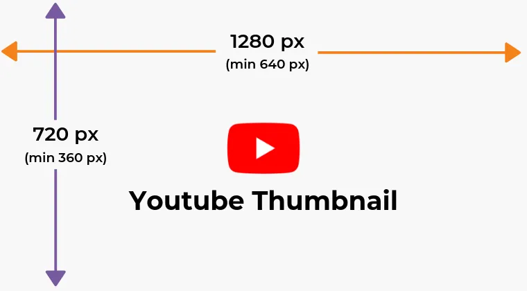
Once you've chosen your preferred software tools, it's time to select an image to upload. This selected image should properly represent your video’s content and captivate the viewer's attention. If you decide to design your thumbnail using an image editing software without a template, it's crucial to adhere to YouTube's parameters.
Ensure that your thumbnail image meets the resolution of 1280 pixels by 720 pixels, with a minimum width of 640 pixels, and adheres to the 16:9 aspect ratio, commonly used in YouTube players and previews. Formats such as JPEG, GIF, or PNG should be used, keeping the file size under two megabytes.
Many templates may already align with YouTube’s thumbnail specs, but it's advisable to verify and adjust as needed. Confirming the size and resolution is essential not only for compliance but also to guarantee your thumbnail has been uploaded accurately on your page. Prioritizing the correct sizing and dimensions from the outset is fundamental to creating a professional-looking thumbnail in line with YouTube's guidelines.
4. Select a Text that Works
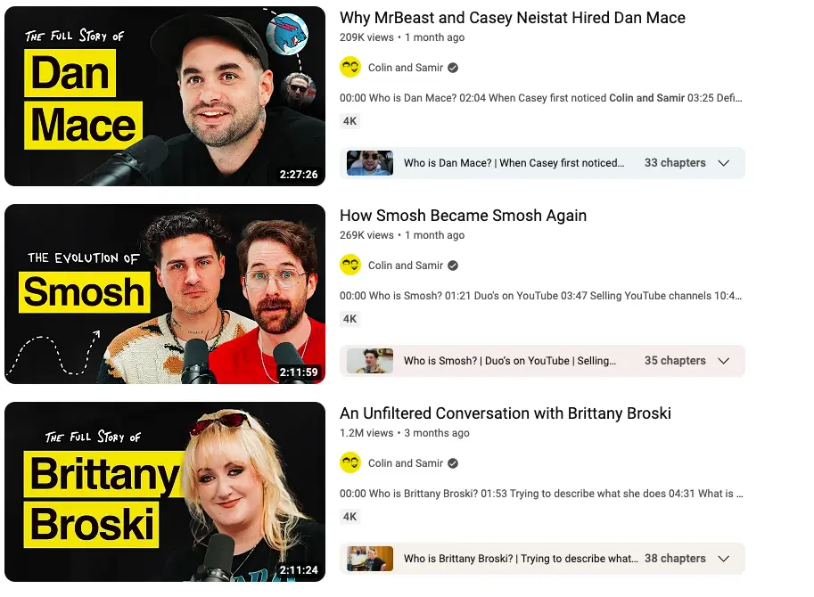
When adding text and a background image to your YouTube thumbnail, choose concise and descriptive text that complements your personal brand. If the visual already tells a story on its own, consider forgoing text. If you decide to add text, remember that less is more—keep it short and focused on the most important information that represents the video content.
Remember, thumbnails are small, especially with over 70% of YouTube's watch time occurring on mobile devices, they become even more compact. Therefore, it's important to avoid cluttering the thumbnail with excessive text.
Choose a legible font and size that stands out against the background and is easily seen on various devices. Ensure your text's placement and contrast are strategic, making it visible without obstructing vital visual elements. Consistency with your channel's branding in terms of text style, font, and colors enhances the overall visual experience for your audience.
5. Use the Right Colors
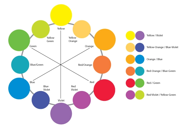
The significance of your thumbnail’s color contrast goes beyond mere aesthetics; it directly influences the readability and noticeability of your custom thumbnail. To effectively utilize color in your thumbnails, it is crucial to focus on bold and contrasting hues that make your content stand out in the vast sea of YouTube videos. For instance, warm colors such as red, orange, and yellow can spark energy and excitement, while cool colors like blue and green evoke a sense of calm or trust.
When choosing your colors, it’s important to consider which ones complement and contrast well with each other. For example, yellow text on a white background would be considered low contrast and more difficult to read than black text on a yellow background, which would have greater contrast. Tools like Adobe Color or color wheel guides can be employed to guarantee effective color contrast in your thumbnail design, ensuring that your content is not only engaging but also easily discoverable on YouTube.
6. Ask Your Audience for Input
If you're torn between a few design ideas for your thumbnail and uncertain about which one is most effective, consider seeking input from your followers. Post a couple of design templates on your social media pages and ask for feedback. You can enhance engagement by posing questions or running polls on platforms like Instagram, Twitter, or others where your audience is active. This direct interaction not only shows your viewers that you value their opinions but also provides valuable insights into what captures their attention and aligns with their preferences.
Involving your audience in the thumbnail creation process fosters a sense of community and increases the likelihood that your thumbnails will resonate with your target audience, ultimately leading to higher click-through rates and video views. Keep in mind that your viewers are your best critics and collaborators, so don't hesitate to tap into their creativity and preferences to refine your thumbnails further.
7. Make it a Template
After you've finished crafting your thumbnail, consider transforming it into a reusable template for future videos. This streamlined approach not only makes creating future thumbnails easier but also ensures consistency across your video content, contributing to a more polished and branded appearance for your channel. Before creating a new thumbnail, especially if using a custom format, it's advisable to save the size and format details of the existing thumbnail as a reference to maintain the established specs.
Employing a consistent thumbnail template offers visual cues to your audience, allowing you to convey information or designate certain videos as part of a series. By utilizing a signature thumbnail style, viewers can easily recognize your content when browsing the platform, contributing to brand recognition and creating a stronger connection with your audience.
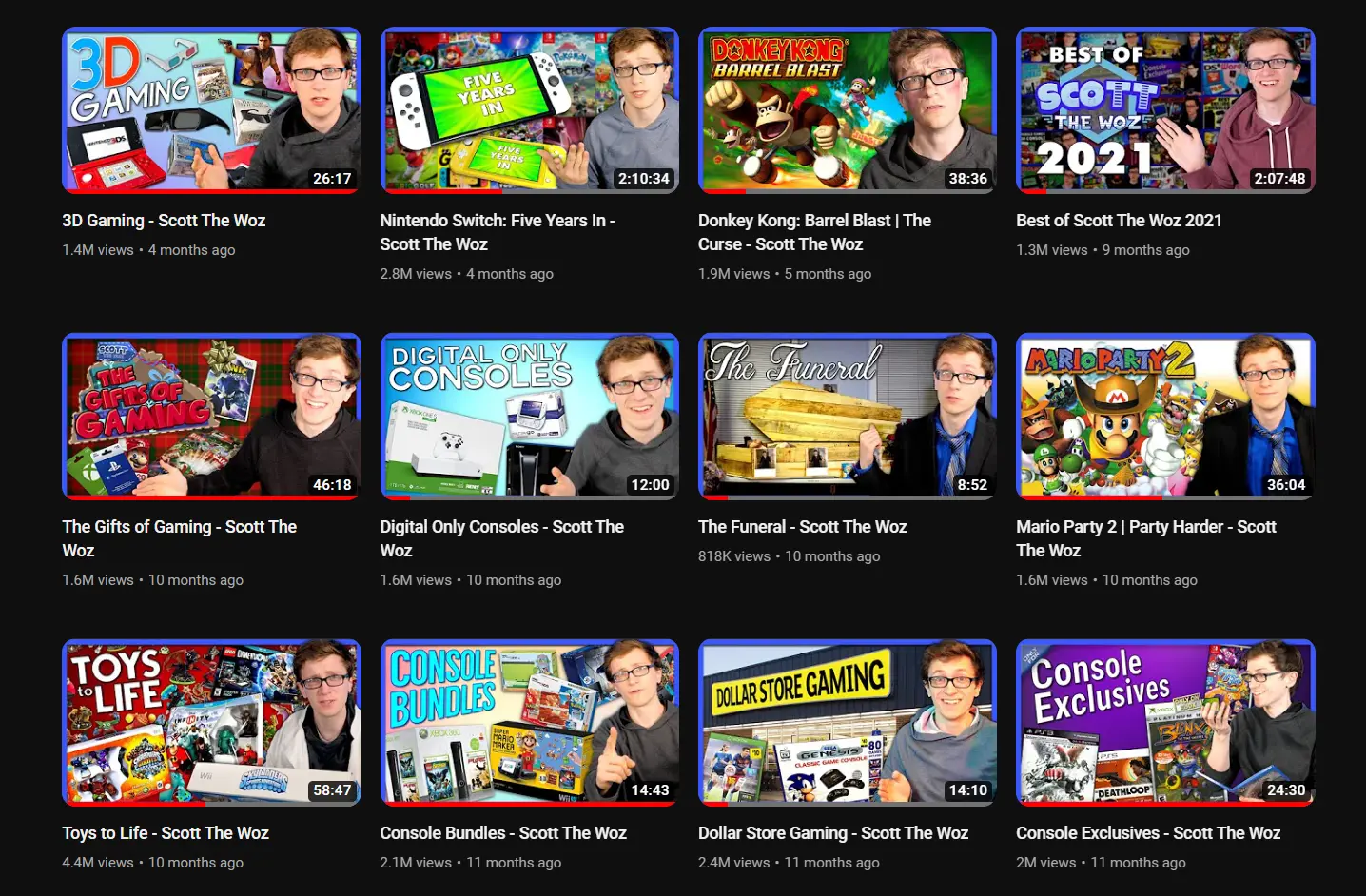
How to Optimize Your YouTube Thumbnail for SEO
Optimizing your YouTube thumbnail is a critical step in boosting your video’s visibility on both YouTube and Google search results. By combining strategic design with thoughtful SEO practices, you can make your video thumbnails stand out and drive more clicks. Here’s how:
Use Descriptive File Names
Before you upload your thumbnail image, ensure the file name is descriptive and includes relevant keywords. Search engines like Google crawl file names, so a well-crafted name can significantly improve discoverability.
Instead of uploading a generic file like "IMG1234.jpg," opt for something specific like "best-youtube-thumbnail-tips.jpg." This simple step aligns your thumbnail for YouTube with the keywords people are searching for, improving your ranking in both YouTube Studio and Google.
Leverage Alt Text for Thumbnails
When uploading your custom video thumbnails, include alt text (alternative text) if the platform allows. Alt text enhances accessibility and provides another opportunity to include keywords. For instance, use descriptions like "Eye-catching YouTube thumbnail for a guide on creating thumbnails" to target SEO while adding context for screen readers.
Include Keywords Strategically
Keywords are essential for SEO, and incorporating them in your file name is a small but impactful tactic. Think about terms your audience might search for, such as "best YouTube thumbnails", "custom thumbnail size", or "1280x720 jpg design tips." For example, naming your file "how-to-create-eye-catching-video-thumbnails.png" improves its relevance and ranking in YouTube Studio and search engines.
Practical Tips for Naming Your File
- Use primary keywords at the beginning of the file name for better indexing.
- Separate words with hyphens (e.g., "youtube-thumbnail-template.jpg") as search engines prefer this format.
- Avoid special characters or spaces in the file name, as they can affect searchability.
Use High-Quality Formats and Dimensions
Search engines and viewers favor high-quality video thumbnails, so ensure your thumbnail meets the optimal YouTube thumbnail size (1280x720 pixels). Save your image as a jpg or png to maintain quality while keeping file sizes manageable for faster uploads. A sharp, high aspect ratio thumbnail conveys professionalism and attracts clicks.
Optimize Design for SEO and Engagement
Design elements such as titles, overlays, and logos contribute to an eye-catching thumbnail that boosts clicks. Use a thumbnail maker or design tool like Photoshop or Snappa to create engaging graphics.
Experiment with bold text, contrasting backgrounds, and clear visuals to make your video content stand out. For added SEO value, align your thumbnail dimensions with recommended guidelines and include relevant keywords in the title or description.
Test and Refine with YouTube Studio
Regularly analyze performance metrics in YouTube Studio to determine which thumbnails perform best. Test variations with different keywords and design styles to see what resonates with your audience. Use click-through rate (CTR) as a guide to refine your strategy and boost engagement.
By applying these SEO tactics, you’ll not only enhance your thumbnail on YouTube but also increase the likelihood of your video content appearing in top search results.
Key Mistakes to Avoid
Remember, your thumbnail is the first thing viewers see when introduced to your content, so make sure it's done right! Below are three key mistakes everyone should avoid before uploading their thumbnail image on YouTube.
- Inconsistent Branding: This is a common error creators should steer clear of. When your colors, fonts, and themes vary across thumbnails, it makes it hard for viewers to identify your videos distinctly. Consistency is particularly crucial for newcomers on YouTube looking to stand out amidst the millions of daily uploads. By maintaining a consistent visual identity, you not only enhance your brand recognition but also make it easier for viewers to associate your content with your channel.
- Overcrowding: Overwhelming your YouTube thumbnail with excessive information is a major pitfall to avoid. Too many images, too much text, and a lack of context can leave a confusing impression on your viewers. To maintain clarity, ensure your YouTube thumbnail design is simple and easy to read.
- Misinformation: Creating thumbnails that mislead viewers by promising content that the video doesn't deliver is a practice that should be avoided. Similar to clickbait articles, misleading thumbnails disappoint your target audience and may violate Google's policies against manipulated or misattributed content. Maintaining transparency helps in building trust with your audience and gives credibility to your brand.
Boost Your YouTube Brand With Fourthwall
By following the tips and tools outlined in this article, you can create effective thumbnails that will help you stand out in a crowded platform. But there's more to enhancing your YouTube presence than just thumbnails.
That's where Fourthwall comes in. As a creator-focused e-commerce platform, Fourthwall offers content creators the tools they need to not only sell products but also create memberships and launch their own websites. By utilizing Fourthwall, content creators can easily boost their branding and monetization efforts on YouTube and beyond. So don't wait, explore Fourthwall today and see how you can take your YouTube channel to the next level.

