

Customers say
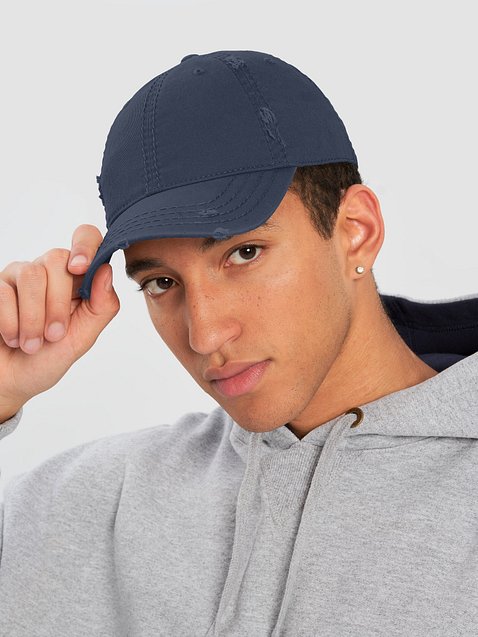
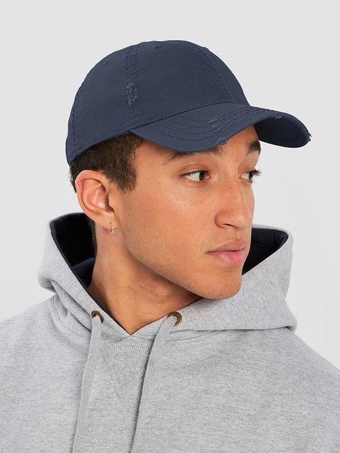
Customers appreciate the overall quality and fit of the hat, noting its comfortable design and stylish distressed look.
The embroidery has received mixed feedback, with some praising its execution while others criticize issues with detail and color accuracy.
Several reviews mention the hat's depth, with some finding it too deep for comfort.
Some users appreciate the consistency of the distressed look, while others feel it lacks randomization.
Overall, the hat is well-received for its aesthetic appeal, though concerns about embroidery quality and fit persist.
Generated from the text of customer reviews
Reviews with images
I have a small head and this is a bit too large. Otherwise, it is a great cap.
Hat looks and fits great! The embroidery is perfect
This is a great hat. The quality is very high. The embroidery is excellent, even over the seams. The distressed parts are perfectly balanced and not too distressed. The shape and fit are great. I love this hat.
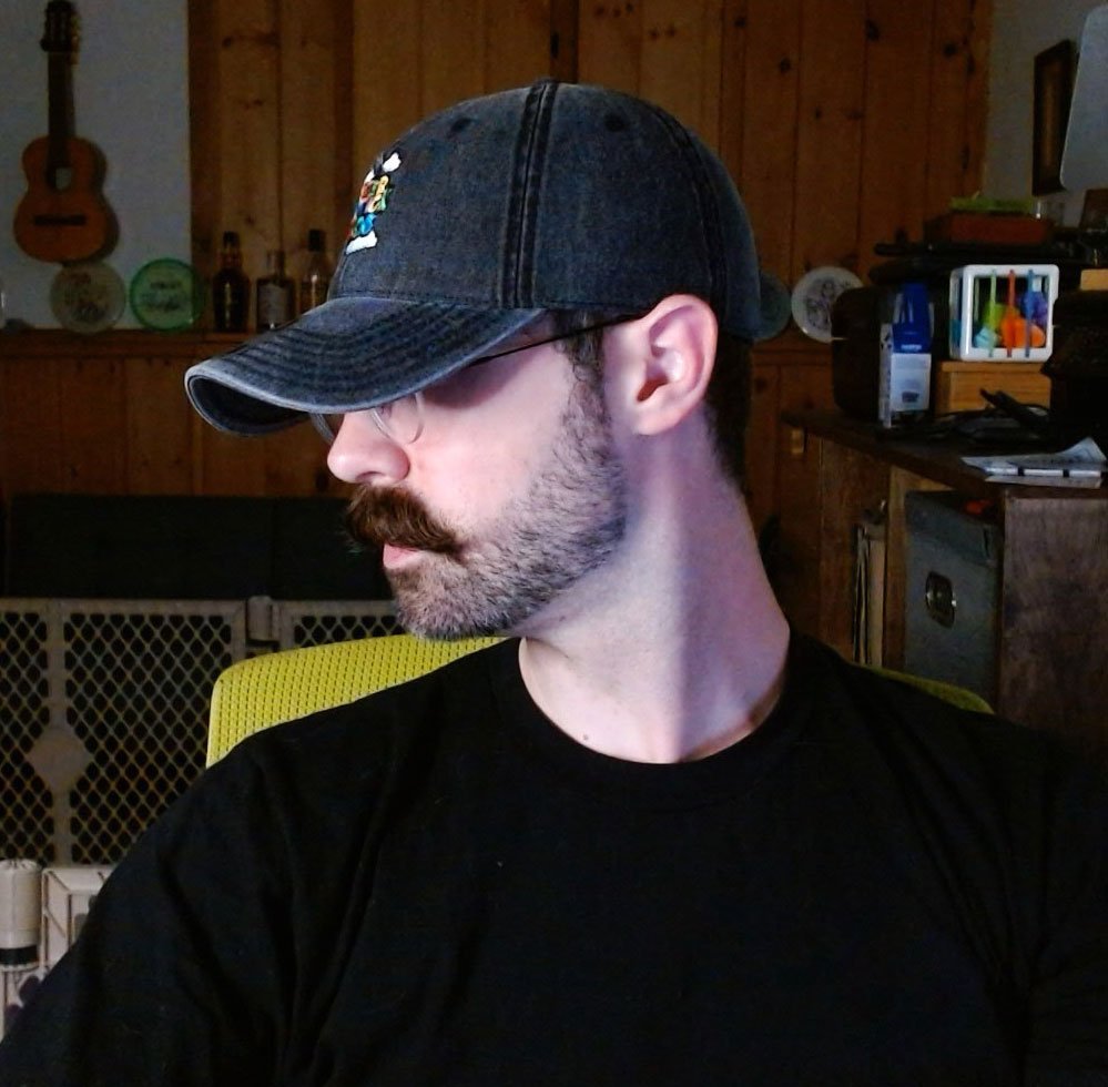
I think the embroidery looks great, however, this hat suffers from being way too deep. On the model, it looks like the hat falls well above the ear line and on my head it's pushing into it and is very uncomfortable.
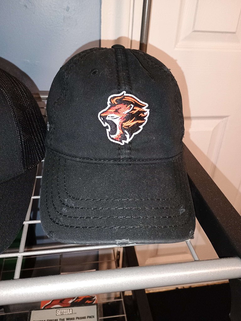
These hats turned out really well! I have embroidery on the front, both sides and the back (though I only took a quick picture of the front). All the stitching appears well done and everything turned out as expected. The "damage" is identical to the images which is both impressive and slightly unexpected, yet great from a consistency perspective. I do kind of wish this hat fit me a little better but it's not a defect, it's just the style. Overall I recommend these if you're looking for a beat up hat right out of the box.

